Showing posts with label Colour Collaborative. Show all posts

Saturday, 2 July 2016

Looking back: June


I've been through so many photographs from June. And for this post I decided to stick with more from our holiday on Skye.


It seems fitting because the Colour Collaborative has now run its course. So as a final post it made sense to celebrate June in glorious Technicolour.


Ice-cream coloured houses at Portree harbour.


Sumptuous Liberty fabrics inside Dunvegan Castle.


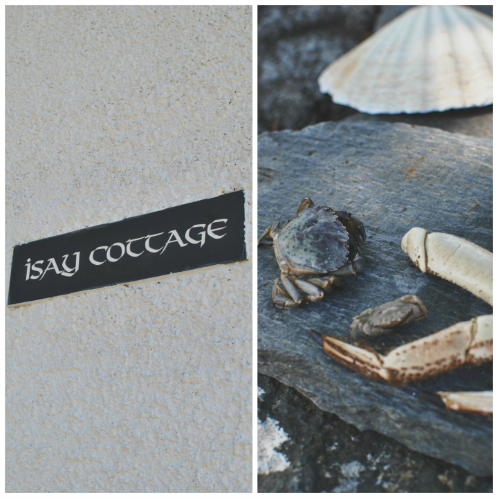
Seaside colours at Waternish.


Skye was an island of blue and green in June.


The Fairy Pools were a strange shade of pale turquoise - almost other-worldly.


And there was bright colour in the castle gardens.


Joe played in the Fairy Pools wearing an appropriately-hued T shirt.


Red and sea-green: one of my favourite combinations.


Abandoned cottages hidden in the greenery...


More green and blue: water reflecting the sky, bluebells still in flower...


 I've also got this photograph in black and white. But I do like the subdued shades here.


The browns of the deep, silent pine forests, punctuated with verdant emerald ferns.


Acid green seaweed...


Gaily-painted boats and raspberry sauce-drizzled ice creams.


Soft moorland shades dotted with fluffy white cotton grass...


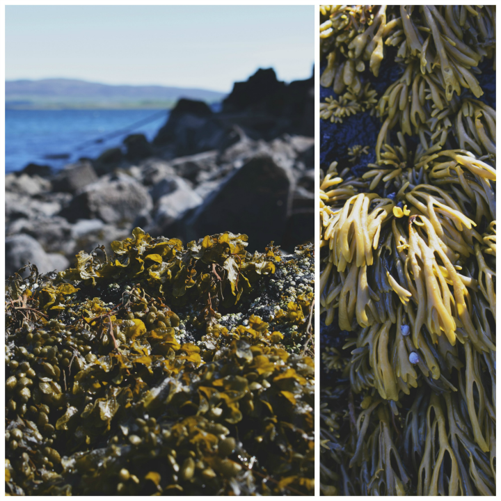
Khaki-coloured seaweed against graphite rocks.


And bright violet orchids growing by the shore.


The gorse was out in all its glory, smothering the hillsides in bright yellow.


And more turquoise: lobster cages washed up and tangled in the grass.


More muted colours: faded red paintwork, greying walls and creamy fleece.


Again at Waternish, an arty little settlement with a beautiful gallery: sun-bleached colours on the Inn sign.


That gorse again. It reminds me of last year's trip across to Bute. Very pretty but lethal if you go near it.


So, Skye in June. I'd love to go back in every season to capture it in photographs.

And farewell to the Colour Collaborative. I enjoyed being a part of it.

Have a wonderful July.


Thursday, 26 May 2016

The Colour Collaborative: May: Photograph


When we first agreed on this month's theme, I did a little secret cheer inside. Another excuse to raid the archives! I love looking back through my photographs and choosing some of my favourites.

But then I thought, do I choose just the one (impossible) that embodies the whole concept of capturing colour in photography? No. I considered why I choose to photograph certain places and subjects in terms of their colour. And I came up with lots of reasons.

There are many 'pet subjects' which I like to capture whenever I get the chance: carousels, boats, vintage cars. But closer to home, on my walks and around the house, colour speaks to me in different ways and there are several aspects of colour, even particular colours themselves, which inspire me. So without further ado: a photo heavy post with few words. Just the way I like it.

Oh, and you may already have seen one or two of these perennial favourites already.


Colours: Orange
I can never resist. Yet strangely enough it's a colour I don't wear. At all.


Subject: Roses
Particularly pink ones. Even better, those with a bluish or lilac tint.


Colour: Verdigris
That blue-green. I have a real Thing for it and am attracted to even the tiniest flash.


Subject: A splash of colour in unexpected places
I'm a lover of murk. Drizzle, damp, moody light. Sometimes you'll catch a glimpse of brightness and it begs to be photographed.


Colour: Yellow
Mustard or sulphur, I adore yellow.


Subject: Dark skies, bright foreground
Up here in the Pennines we get our fair share of ominous, battleship-grey skies. They provide an incredible foil for whatever stands between you and the clouds.


Colour: Blue
Kingfisher, cobalt, sapphire. The identification spray on the fleece of a sheep, the unexpected blue eye of a skewbald horse.


Subject: Colour in decay
There's something about the colours of flowers as they wither and become fragile; some seem to concentrate all that pigment so it becomes even more vivid, whilst others (hydrangeas being a favourite) fade and take on a sepia-like quality.


So there you have it: a lot of pictures which I hope illustrate my relationship with colour when I'm taking photographs. No one particular image which, to me at least, is colour perfection. But I'm looking forward to seeing how my fellow Collaborators have chosen to interpret the theme...


Don't forget to visit the other Colour Collaborative blogs for more of this month's posts, just click on the links below.


What is The Colour Collaborative?

All creative bloggers make stuff, gather stuff, shape stuff, and share stuff. Mostly they work on their own, but what happens when a group of them work together? Is a creative collaboration greater than the sum of its parts? We think so and we hope you will too. We'll each be offering our own monthly take on a colour related theme, and hoping that in combination our ideas will encourage us, and perhaps you, to think about colour in new ways.


Related Posts Plugin for WordPress, Blogger...